


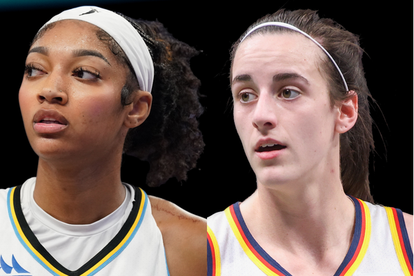
After so long of fans asking “Where’s Caitlin Clark’s shoe?”, the answer is finally here– sort of. Nike has revealed Clark’s official logo and announced that her full signature apparel collection will drop on October 1, while her first-ever signature sneaker is scheduled for 2026. Fans should be thrilled, and many are, but the excitement isn’t without a catch. They don’t love the logo and say Angel Reese’s design tops it.
On August 25, Nike and Clark revealed her signature logo in a slick teaser video, complete with billboards rolling in and a radio announcer hyping her rise as a cultural icon. The logo features two interlocking C’s, with a smaller hidden C tucked inside. It’s all meant to capture the idea of her magnetic connection with fans and how her excellence is built from the inside out. Nike describes it as “an instantly recognizable combination of interlocking C’s as extraordinary as the athlete they represent.”
The logo will debut across a full line, including hoodies, shirts, shorts, and pants for all ages, plus some premium pieces in adult sizes only. In the press release, Clark shared her excitement: “To me, this is more than just a logo; it’s a dream come true. People always talk about leaving your mark on the game—and this is another way I can do that.” Even ClutchPoints announced this breaking news on their social handles, with a caption that matched the same energy.
ADVERTISEMENT
Article continues below this ad
“Caitlin Clark’s official logo is here. Clark’s full signature apparel collection drops October 1, with her first signature shoe arriving in 2026. All part of the historic 8-year, $28 million endorsement deal she signed with Nike in April 2024.” But despite Clark’s heartfelt enthusiasm, many fans weren’t sold on the design.
Caitlin Clark’s official logo is here 🔥
Clark’s full signature apparel collection drops October 1, with her first signature shoe arriving in 2026.
All part of the historic 8-year, $28 million endorsement deal she signed with Nike in April 2024.
That’s the most lucrative shoe… pic.twitter.com/P3vhNNpI30
— ClutchPoints (@ClutchPoints) August 26, 2025
Criticism has been pouring in ever since with sharp comparisons with Angel Reese’s Reebok deal. This is what they have to say:
ADVERTISEMENT
Article continues below this ad
Fans stand in solidarity with Angel Reese
Many argued that the Chicago Sky star’s Reebok logo is a clear winner. “To be honest, the most visually appealing among the five and most identifiable is Angel Reese’s logo. Then Sabrina’s (though hers could be confused with Syracuse),” one user wrote. Another agreed, praising the elegance of Reese’s design:
“For me, I prefer AR; the CC has to grow on me, and Sabrina’s looks like Slam magazine’s logo.” While Sabrina Ionescu’s bold “S” has its fans, most felt Reese’s curved “AR” lettering gave her an edge. As one fan summed it up: “Angel’s is the best, clearly.” Others got creative with their takes.
Top Comment by

I much prefer the CC logo. I would never buy anything that has the AR logo on it. I don’t...more
Share your take
“Angel’s logo reminds me of the movie, ‘Angels in the Outfield’ for some reason. The only one I don’t get is the A’ja logo,” a fan noted, before critiquing A’ja Wilson’s design for being hard to read, despite its bold splash and hidden sneaker outline.
ADVERTISEMENT
Article continues below this ad
Even Sabrina’s minimalist approach didn’t escape criticism. While some vouched for her “S” logo, another commenter laid out the hierarchy plainly: “Angel’s is the most identifiable and cuter than all of them. Then A’ja’s is kind of cool, and Breanna’s. The other two—kind of lazy logos, and they have them anything.”
Top Stories
Reese’s design even drew unexpected compliments: “While Reese’s logo reads elite and like a Barbie’s,” one fan said, adding that A’ja Wilson and Breanna Stewart have “modern and logo-worthy” designs, but Clark and Sabrina’s felt “lazy and unimaginative.” Despite it all, as fans come to terms with Nike’s latest update, it will be exciting to watch what the brand and Clark have in store for the upcoming sneaker collection.
ADVERTISEMENT
ADVERTISEMENT
ADVERTISEMENT
ADVERTISEMENT

Does Angel Reese's logo truly outshine Caitlin Clark's, or is it just fan bias?